
MASV Brand & Web Redesign
Situation
MASV is a fast, easy-to-use file transfer platform for creative professionals handling massive data. Competing with IBM, Signiant, Dropbox and WeTransfer, the brand needed a unified story to reach new markets.
The MASV brand consisted of a logo, but given the startup nature of the business, there had not yet been a brand system implemented to ground a broader-reaching narrative through from marketing, to web and the product.
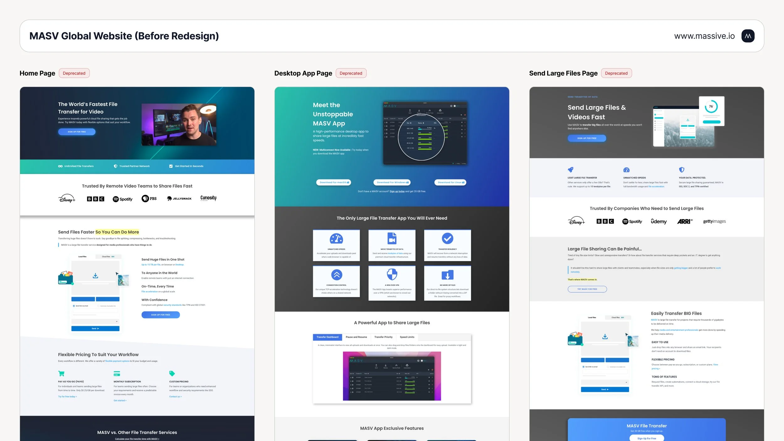
The global site was WordPress-based, marketing-managed, with an prioritization towards driving traffic via SEO rather than on a value-driving conversion funnel. Without a cohesive identity, clear conversion path, and scalable navigation model, the site performed below expectations with high-bounce rate and missed revenue opportunities.
As Lead Product Designer, I partnered with the CEO, Head of Growth, and Head of Content to define a scalable brand system, refined web hierarchy and conversion funnel that aligned with all stakeholders.
Task
To get started, I established an alignment cadence with Leadership, Sales and Marketing stakeholders to define brand principles and set key milestones. To achieve our goals, the task involved 3 main pillars:
Unify the brand values, mission and visual language across marketing and product to set forth a cohesive foundation from which to build from. Design a brand system guideline to set the standard, then scale the business and brand.
Audit the current global web site to flag areas of current concern and future opportunity. Establish key focus areas for design influence, which includes setting a direction for copy, visuals, page architecture, site navigation and mobile responsiveness with the converging aim of driving improved conversion through a user value funnel. Lead design, handoff and implementation efforts, including QA.
Meet with Heads of Growth, Sales and Customer Success to map the new pricing strategy. Explore and execute UX approaches to implementation that minimize friction within the purchasing flow.
Action
🌐 Global Website Redesign
In a parallel workflow alongside the development of the brand system, I had designed the global website with the following key achievements:
Rebuilt IA and navigation through stakeholder interviews and lightweight card sorting. This involved restructuring the top level navigation for business clarity with Features, Pricing, Resources, and Contact.
Responsive, multi-surface browsing optimizations (mobile/tablet/desktop). As more potential users discover the product through social media or word of mouth, it’s imperative that their experience of the site be effective as intended. Worked closely with engineering to improve page scaling and implement a grid structure, allowing for dynamic yet feasibly grounded content layouts regardless of browsing device.
Optimized the conversion funnel from landing to signup. Added the signup form directly to hero section, clarified primary CTAs, removed competing actions, strengthened benefit-led headlines, prioritized value-forward content and visuals.
Elevated brand trust with enterprise proof points, case studies, testimonials, recognizable client logos, and a consistent visual language.
Delivered end-to-end specs in Figma with responsive behavior and accessibility requirements. Partnered with Engineering and Marketing throughout implementation, QA, performance checks.

🎨 Brand Systems Guideline
In coordination with the CEO and Head of Marketing, we aligned on a Mission Statement, Voice & Tone framework and set of Value Attributes, around which to build.
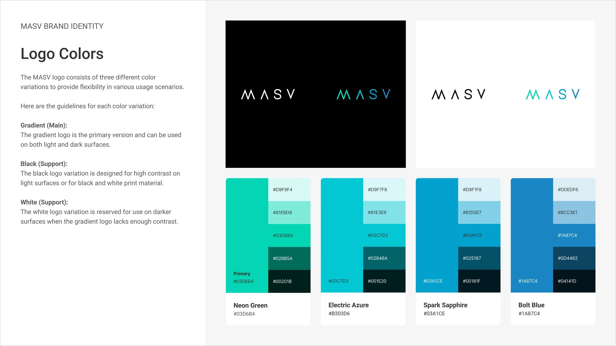
Logo
MASV had an existing logo, which was known and recognized. This logo needed revision with some minor adjustments and some guidance around construction, spacing, positioning, colour, usage.
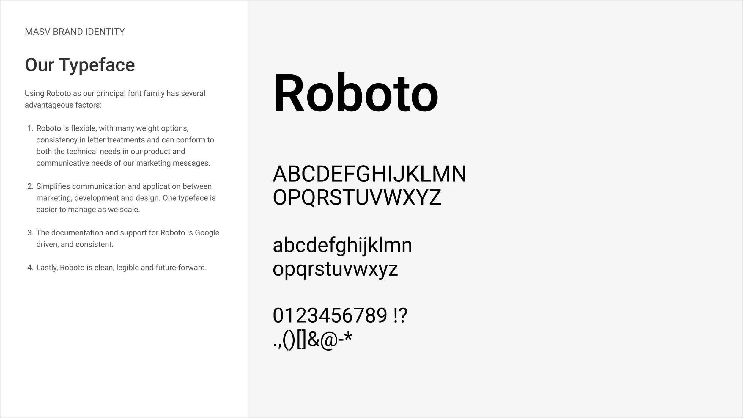
Font Family
The MASV end-to-end experience had been using a misaligned set of font families that broke brand cohesion, negatively impacted legibility and was flagged a complicating implementation for Engineers/Designers. To resolve these font management complexities, Roboto was to be used across web and product experiences.
Colour
MASV’s existing 4 colour hues were pulled from the logo and had no guidelines around usage. In order to embrace those colours and develop a system for their usage, I expanded the hues tied to each colour. This opened up flexibility of use by allowing for contrast, variety and further creative opportunities with composition.
Apart from the brand colours, I defined a set of universal special case colours including styles for buttons, success/warning/critical states and neutral tones. All of these colours were built with WCAG accessibility considerations as well a token variants to enable the implementation of a highly requested dark-mode.
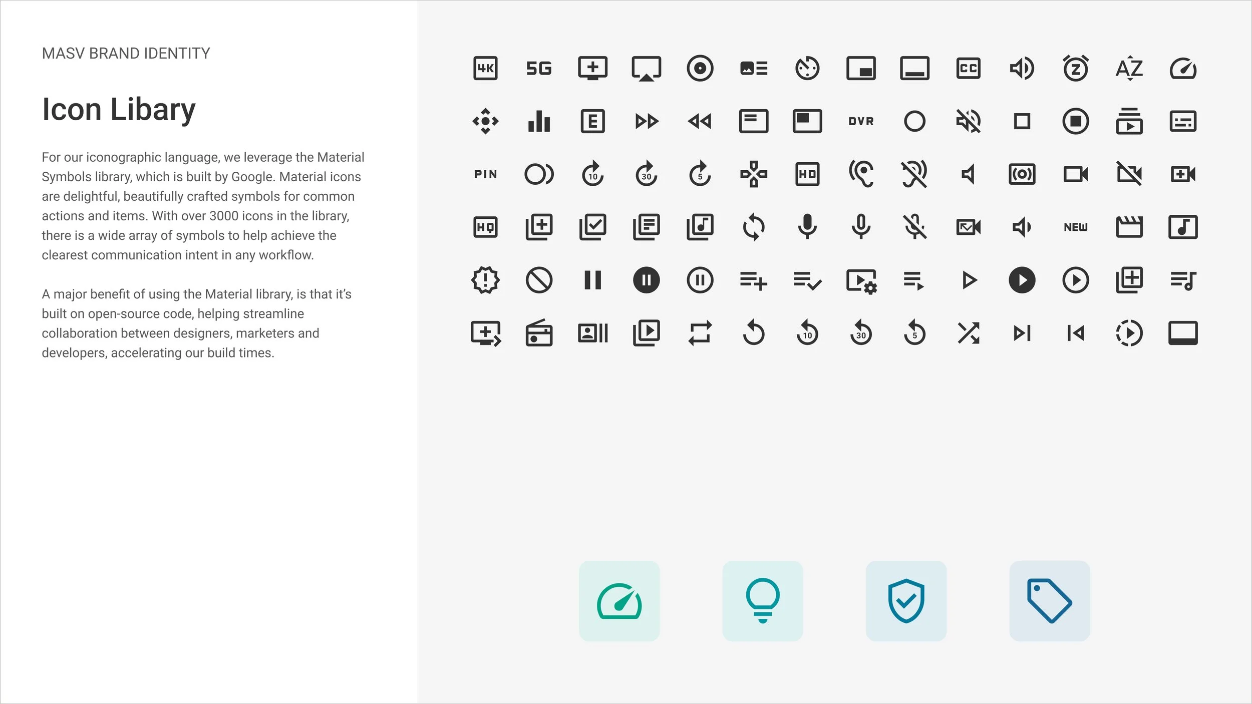
Iconography
Previously, the Marketing and Engineering teams would pull their icon assets from different sources. To unify the visual language and improve implementation efficiency, the Google Material Symbol library was the most seamless choice. The library of 3000 icons was comprehensive enough to meet our communication needs and included resources for seamless Engineering implementation.
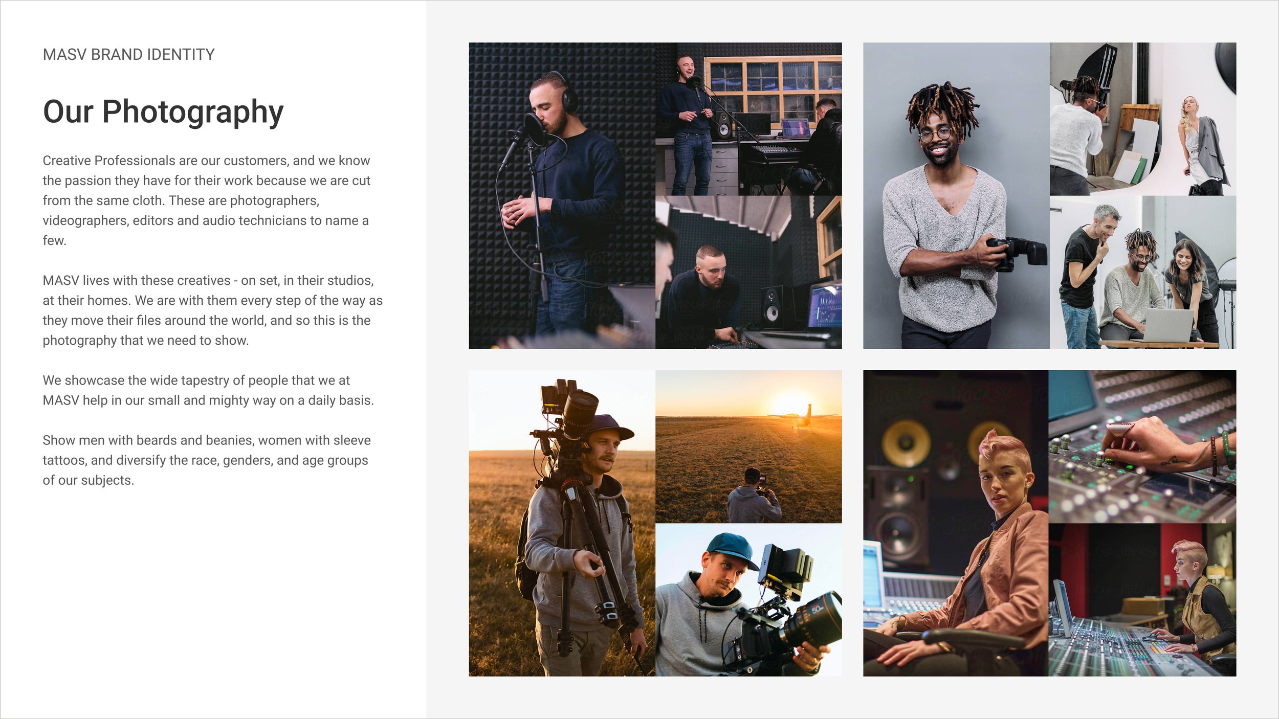
Product Imagery/Photography
MASV is a product for creatives and industry professionals and these users needed to be represented in our brand system. To do so, the system would merge product imagery with photography representing these personas in their working environments. Using real faces is a proven communication method with real conversion outcomes.
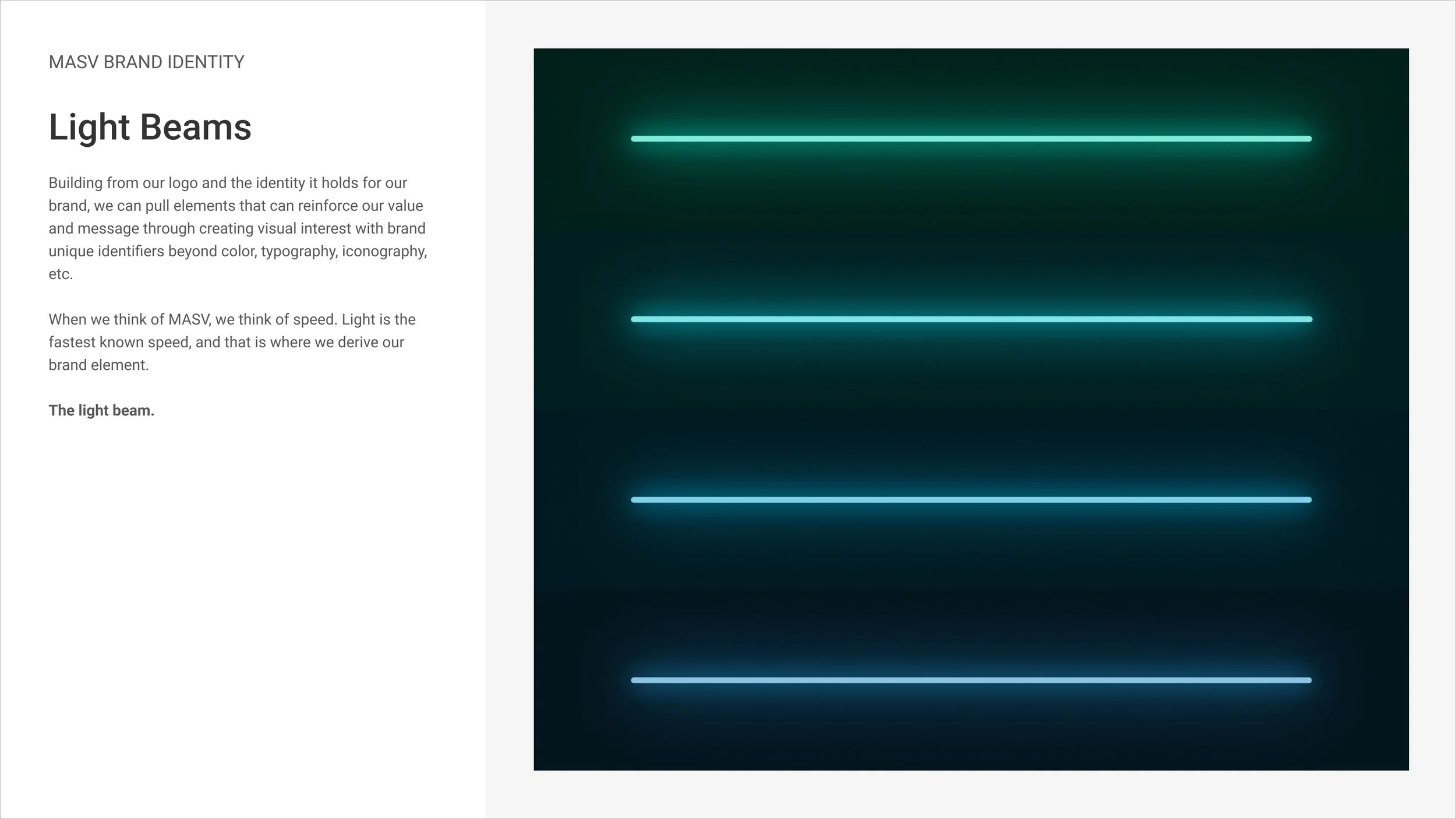
Lastly, the system needed a visual motif that could be representative of MASV’s value attributes, distinguishable from competitors and also complimentary to presentation of the MASV brand. Given the emphasis on speed, progress, movement and innovation, I designed a light-beam motif that could be used in a variety of ways. See below for examples of its implementation.


Results
The MASV brand and website relaunch delivered measurable growth:
+34% homepage signup conversion following site and brand revisions
+200% increase in overall web traffic to masv.io following site and brand revisions
Record monthly revenue following launch of revised pricing experience
Beyond the metrics, the relaunch strengthened brand credibility and customer trust, which was a key goal from leadership. Cross-functional collaboration with Engineering and Marketing, plus rigorous testing and accessibility work, turned the strategy into a durable operating model. This showed that impactful design leadership depends on systems thinking and partnership, not just visual refresh.
Team
Lead Designer: Paul Methot
Brand Designer: Brook Wells
Head of Content: Ankit Verma
Head of Growth: George Vulic
Customer Success & Sales: Mathew Sobkowicz, Jon Riis
Engineering: Curt Conway
CEO: Greg Wood